If there’s one thing Stranger Things 4 proves, it’s that colour can do heavy lifting in narrative storytelling. Costume designer Amy Parris revealed that the distinct palettes for Hawkins and California weren’t arbitrary; they were a deliberate choice to make the audience feel the differences in environment, mood, and character mindset.
“It’s so fun because [the production team gets] to kind of capture California versus Hawkins through colour,” Parris shared. Hawkins, while still vibrant, remains grounded in its familiar nostalgia, with a slightly gritty, saturated look. Gone are the dusty, rusty browns of Seasons 1 and 2, replaced with deeper, more refined hues that underscore the town’s enduring mystery and foreboding suspense.
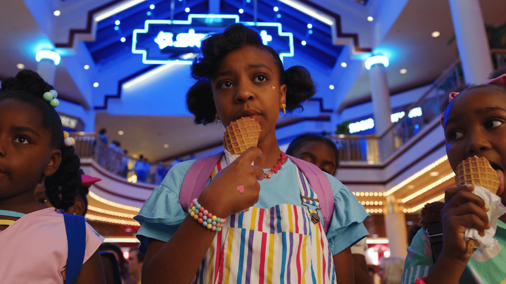
California, on the other hand, bursts onto the screen with playful tones—baby pinks, teals, purples—that scream freedom, adolescence, and summer energy. These choices allow viewers to feel the contrast between the foreboding chill of Hawkins and the sun-soaked optimism of California. It’s not just about aesthetics; it’s about emotion. By immersing the audience in these colour worlds, the show gives every scene a subtextual layer, guiding reactions to tension, joy, and dread.
Colour as a Storytelling Device in Stranger Things 4
The way Stranger Things 4 moves between Hawkins and California is almost like travelling through two entirely different worlds, each with its own visual language. Hawkins’ saturated, slightly nostalgic palette retains the eerie undertone fans have come to love. It’s a subtle nod to the earlier seasons while enhancing suspense and drawing viewers into a familiar yet dangerous environment.
California, by contrast, pops. Its bright and playful colours immediately communicate freedom, movement, and a sense of possibility. Parris explained, “It’s way more sun-soaked and saturated as opposed to the richer colours of Hawkins.” The visual juxtaposition mirrors the characters’ experiences—Hawkins is the crucible of fear, the place of trauma and supernatural peril, whereas California represents growth, exploration, and the messy fun of teenage life.
By using colour as a narrative device, Stranger Things 4 gives its audience a sensory anchor. You can often gauge which storyline you’re in before a word is spoken simply by noting the palette. The approach adds a cinematic richness to the storytelling, proving that costume design is not merely decorative but central to narrative immersion.
Costume design in Stranger Things 4 isn’t just about visual storytelling—it’s also about grounding characters in a tangible, believable world. Collaborations with brands like Converse show how fashion and function intersect with narrative. For instance, Hawkins High School characters wore customised Converse shoes in their pep rally scene, each colour corresponding to the school’s palette.
These choices aren’t just aesthetic flourishes; they serve to enhance authenticity and give fans a bridge into the world of Hawkins. By incorporating real-world brands and familiar fashion, the show fosters a sense of connection. Viewers feel like they could step into the world themselves, from walking the hallways of Hawkins High to chilling under California sun-soaked skies.
The use of brand partnerships also shows a savvy understanding of cultural resonance. It aligns the characters with iconic, recognisable fashion, while maintaining period accuracy and narrative purpose. This careful attention to detail reinforces the Duffer Brothers’ overarching commitment to nostalgia, storytelling, and emotional engagement.
As anticipation builds for Stranger Things 5, the legacy of Season 4’s costume design underscores the series’ power in blending visual storytelling with character development and cultural touchstones. Each hue, each fabric choice, and each brand collaboration enriches the narrative, immersing viewers in the world of Hawkins and beyond. The careful thought behind every palette reminds fans that Stranger Things is as much a visual experience as it is a thrilling story of friendship, courage, and the supernatural.
By weaving colour, fashion, and location together, Season 4 sets a high bar for storytelling through design—a bar that fans will undoubtedly be eager to see pushed even further in the final season.

