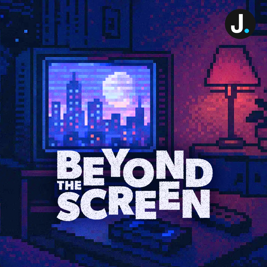
The title sequence of Stranger Things has become iconic in its own right, serving not only as an introduction to the series but as a concentrated expression of its 1980s inspirations. The close-up shots of individual letters, the deep red glow against a stark black background, and the slow sliding movement of the typography create an aesthetic that immediately situates viewers in the show’s world. This distinctive design was developed by the creative studio Imaginary Forces under the direction of Michelle Dougherty. Their collaboration with the Duffer Brothers shaped a title sequence that functions as both a stylistic hallmark and a visual bridge to the series’ narrative tone.
The conceptual foundation of the sequence was directly informed by the creative vision behind Stranger Things. Shawn Levy introduced the Duffer Brothers to Imaginary Forces, initiating a process in which the showrunners shared the pilot script, synth-heavy music samples, and a curated selection of 1980s book covers—particularly from Stephen King—that captured the atmosphere they wanted to evoke. The brief centered on developing a typographic title sequence that would feel authentic to the era while complementing the show’s themes of mystery and supernatural tension. From the outset, the designers leaned heavily on the graphic sensibilities of early 1980s cinema, studying title sequences created by Richard Greenberg for films such as Altered States and The Dead Zone, as well as consulting designer Dan Perri, whose typography helped define the visual language of several major films in that period.
Early explorations ranged from conceptual ideas involving disappearing letters to evoke the show’s recurring motif of missing people, to shadow-based compositions emphasizing its darker undertones. Numerous font tests were conducted, with the team capturing close-up footage of different typefaces and experimenting with potential layouts. Through these iterations, a typographic direction began to solidify: a focus on letters that glide into place, building tension through their deliberate motion and forming a sharp, bold title that mirrors the show’s atmosphere.
The font that ultimately defined the sequence is ITC Benguiat. While the team considered several alternatives during development, the producers expressed a strong preference for Benguiat before the sequence was finalized. As a result, the studio reworked their designs to incorporate the font, ensuring it aligned with the overall creative vision. ITC Benguiat, created by type designer Ed Benguiat in the late 1970s, carries the serif-driven, slightly gothic style that became synonymous with genre paperbacks and movie marketing of the early 1980s—making it a fitting choice that subtly reinforces the show’s cultural roots.
Although the final sequence is rendered entirely through computer graphics, the team drew heavily from practical methods used during the era they were emulating. Traditional Kodalith masking techniques, once common in visual effects production, influenced the development of custom filters used in the rendering software. This hybrid approach produced a look that feels both digitally precise and reminiscent of optical effects work from decades earlier. For the individual episode title cards, the team adopted a “fly-through” technique inspired by the film Bullitt, an idea suggested by the producers. This method added movement and spatial dimension that tied the episode titles more deeply into the show’s atmospheric identity.
As Stranger Things continues to resonate with audiences through its blend of nostalgia and contemporary storytelling, its title sequence remains one of its most recognizable elements. The careful consideration behind the choice of ITC Benguiat and the meticulous process of constructing the sequence demonstrate how visual design can enhance narrative tone. Every detail—from the texture of the letters to the pacing of their movement—serves the larger creative goal: immersing viewers in a world that is familiar, unsettling, and unmistakably tied to the cultural imagination of the 1980s.