In Severance, colour is more than just a purely visual choice, it’s a telling language that speaks volumes about the show’s intricate themes and character dynamics but only if you spot the parallels. From the chillingly sterile offices to emotionally charged moments, colour subtly shapes our understanding of the Severed world.
Diving deep into the use of colour in Severance reveals how the show weaves meaning into every frame, especially through the lens of Kier Egan’s four tempers: woe, frolic, malice, and dread.
Kier Eagan’s Four Tempers and Their Colour Codes
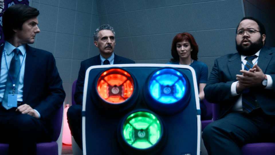
A fascinating aspect of Severance’s design lies in how it applies Kier Eagan’s ancient temperaments - woe, frolic, malice, and dread - to its visual storytelling. These four emotional states are directly mapped to colours seen on the Macrodata Refiners’ computer screens: woe is green, frolic is yellow, dread is red, and malice is blue!
This system does more than add visual flair; it acts as a coded language that reveals the emotional landscape of the characters and their environment and could link to the soul's they are mapping on screen.
These colours don’t just stay confined to the monitors; they bleed into the Severed employees’ lives in symbolic ways. Helly R’s signature blue wardrobe connects her to malice, suggesting a deeper undercurrent of conflict or suppressed aggression waiting to burst out against the system. Yet in a compelling twist, during the Musical Dance Experience, Helly dons yellow, the colour of frolic, highlighting a rare moment of vulnerability or forced levity in the midst of her otherwise tense persona.
Colour as Emotional and Narrative Signposts
Colour in Severance becomes a powerful emotional barometer, marking pivotal moments in the story. Consider Dylan’s immersion in red light during the same Musical Dance Experience sequence. This red hue, representing dread, coincides with a devastating revelation: his Outie has a son and his Innie has now met him. The tension escalates as Dylan’s frustration culminates in a violent outburst against Mr. Milchick, with the stark contrast of red blood on Milchick’s immaculate white jumper underscoring the danger and passion tied to the colour red.
Red, as an anomaly amidst the usual blue and green tones of the Severed environment, grabs attention and signifies moments of crisis or emotional rupture.
The selective use of colour intensifies narrative beats, guiding viewers’ subconscious understanding of what’s truly unfolding beneath the Severed floor’s cold surface. Red, as an anomaly amidst the usual blue and green tones of the Severed environment, grabs attention and signifies moments of crisis or emotional rupture. This is particularly highlighted at the end of Season 2 where Mark S makes the decision to live a few seconds more with Helly R instead of the, now rescued, Gemma. He and Helly run back towards the danger down the severed corridors bathed in red with The Windmills of your Mind playing. This shows their passion, future danger and true love.
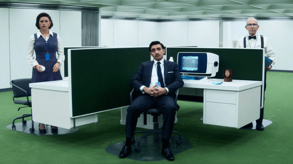
Inside Lumon’s Severed floor, the colour palette is predominantly cool - cool-toned white walls in a blue hue and green carpets (or grass in Mamallians Nurturable) create an atmosphere of detachment and control. Yet also mimic nature - the sky and grass - neither thing an innie will ever seen.
These muted hues evoke a clinical, almost hypnotic environment, reinforcing the theme of suppression and psychological manipulation central to Severance. When red punctuates this cold space, whether it’s the red ball in Ms. Huang’s game or the blood from Dylan’s attack, it acts as a jarring disruption - a visual metaphor for rebellion, violence, or awakening.
Mark’s interactions in the supply closet and Helly’s brain scan scenes also echo this careful balance of colour symbolism, where shifts in hue hint at the characters’ emotional and psychological states. What about Irving smashing the devilled egg into the Lumon Handbook bathed in blue and pink lights? Perhaps a visual representation of his two minds.
The persistent presence of blue and green contrasts sharply with those rare moments when red or yellow appears, underscoring Severance’s mastery in using colour not just as decoration but as a narrative tool.
Colour As A Hidden Key to Unlocking Themes and Emotions
The deliberate use of colour in Severance elevates the show from a dystopian thriller to a richly layered psychological drama. By aligning colour with Kier Eagan’s four tempers - woe (green), frolic (yellow), malice (blue), and dread (red) - the series creates a coded emotional topography that rewards attentive viewers. Whether it’s Helly’s shifting wardrobe hues, Dylan’s blood-streaked violence, or the cold tinting of the Severed floor, colour is integral to understanding the complex inner worlds of the characters and the corporate control they are trapped within. For fans eager to peel back the layers of Severance, colour offers a fascinating, subtle lens through which to explore the show’s deeper meanings.
If you're someone who doesn't see these extra details, you may be part of the Outie audience!